Team
Client, Printer, Myself as Design Team
Materials
Print & digital
Goals/ Objectives
Create brand identity
Deliverables for Patent Board for approval; logo, business card, pitch box
Website development
Let people know the product is available by marketing to targeted industries

logo animation
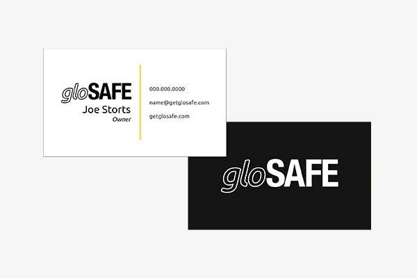
Business card. The yellow line on the front side and the logo on the back side were overlaid with a raised gloss
Development
In order for the product to begin manufacturing, a patent was needed. The patent approval board requires proof of development - a logo, business card and the product itself was needed.
Choosing a font to show the attention-grabbing and life-saving aspects of the product to reflect in the logo was essential. From there, I came up with some alternative ways to show the product “in action”.
setbacks
I was lucky enough to have been given full creative freedom from my client. The only hiccup we’ve faced so far is the disconnect in terminology which has required extra effort to explain my design choices to the client - not exactly what I’d call a setback.
However, with this creative freedom, I also need to keep a realistic mindset on what deliverables are needed and how to acquire them. Working with the printer, some creative compromises were made for productivity and budget restraints. Developing the product and company in the midst of a pandemic has also proven to be quite difficult.
Outcome
While still a work in progress, so far we have a working logo, business cards and are currently working on a pitch box for the patent board for approval.
Next Steps/ Results
Stay tuned to see more!
Research/ Insight
Researching construction etiquette and the lack of respect for construction sites resulting in extremely dangerous, if not deadly, situations. Looked at other logos, websites and marketing plans for companies in the same industry.
The product in development is the first of its kind, so research was focused on what sets it apart from current products on the market and why they lack in comparison and how to stay ahead of the pack.
I wanted the logo to reflect the purpose of the product; safety. So I researched how to show safety and stability in a static mark. From that research came the font and color choice for the identity.

Sketches for pitch box. Changes were made to accommodate productivity and budget restraints

Unassembled pitch box and product sleeve